

Quick answer: Winning with AI visuals isn’t about better prompts — it’s about consistency: lock a style formula, build a 10-image style bible, and never improvise the locked tokens. Generate the background in AI and add all text in Canva with your brand fonts (Ideogram is the usable exception for simple text). The whole system runs on a 30-minute weekly batch.
Every visual on this site — the featured images, the in-article graphics, the social promos — is AI-generated. Not because we’re cheap (though it helps), but because once you build the system, it’s faster and more consistent than stock photos or briefing a designer for every post.
But here’s what most guides won’t tell you: the accounts winning with AI visuals aren’t winning because the images are stunning. They’re winning because they’re consistent. A feed of decent images in one recognizable style beats a feed of random gorgeous images every time. Your followers should recognize your look before they read your name.
This guide is the full system we actually use: the style formula, the prompt formulas, the text problem solved, and the weekly batch that keeps it sustainable.
The real game: consistency, not quality
Scroll through any successful AI-powered account and you’ll notice something. The individual images aren’t necessarily masterpieces. But they belong together — same palette, same mood, same visual language. That cohesion reads as “brand” to a viewer’s brain in about half a second.
Random beautiful images read as “AI slop,” and audiences have developed a finely tuned radar for it. The waxy skin, the generic purple-blue gradients, the floating nonsense objects. The moment your visual looks like everyone else’s AI output, you’ve lost the scroll-stop.
So the goal isn’t the best image. It’s your image, repeatable, fifty times in a row. Everything below serves that.
Step 1: Build your style formula (do this first)
Before you generate a single post image, lock your style. This is the highest-leverage 20 minutes in AI social content.
A style formula is a fixed suffix you append to every prompt. Ours, for example, might read:
“flat vector illustration, warm coral and cream palette, minimalist composition, soft shadows, no text”
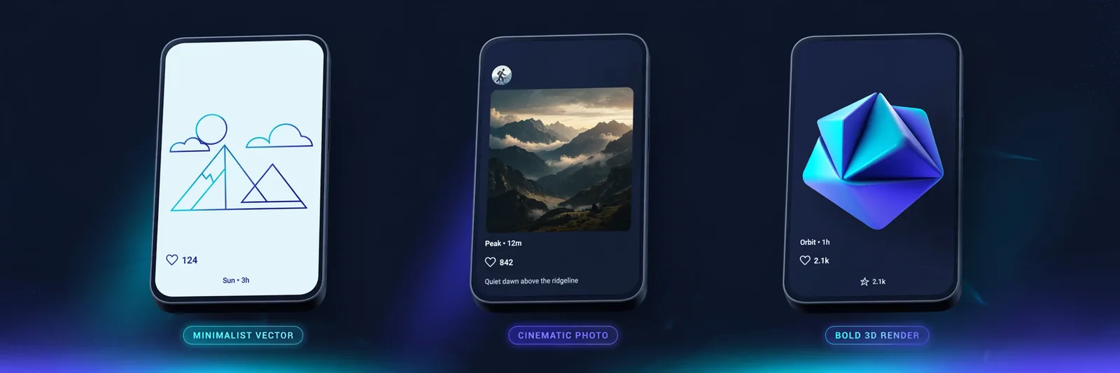
Yours might be cinematic photography, or bold 3D renders, or watercolor. The specific style matters less than the locking. Same tokens, every prompt, every week.
The three locks that make it stick:
- Locked palette. Name 3–4 colors. “Warm coral and cream” beats “nice colors” because the generator can actually reproduce named palettes consistently.
- Locked style words. Pick your medium descriptors (flat vector, cinematic photo, 3D render) and never improvise them. Improvisation is how feeds drift into chaos.
- Locked exclusions. Always end with what you don’t want: “no text, no watermark, no photorealistic faces” — whatever your failure modes are.
Then build a style bible: your 10 best generations in a folder. When something looks off, compare against the bible instead of guessing. When you try a new tool, feed it the bible as reference (Midjourney‘s style reference, or just describe the look). Ten images, and your brand has a visual memory.
Step 2: Pick the right tool for the job
Not all generators serve social equally. Match the tool to the task:
- Everyday posts, free: Leonardo.Ai or Microsoft Designer — genuinely good quality at zero cost.
- Maximum polish: Midjourney. Worth it if visuals are your brand (photographers, designers, aesthetic accounts).
- Text inside the image (quotes, announcements): Ideogram — the only one I’d trust with words, and even then, proofread every letter.
- Inside a design workflow: Canva’s generator, for when the image is one element of a bigger layout.
One primary generator plus Canva covers 95% of creators. Tool-hopping is the enemy of the style formula — every new tool interprets your locked tokens slightly differently.
Step 3: The social prompt formula
Social prompts differ from art prompts. They need clarity at phone-screen size and instant impact. After hundreds of generations, ours looks like this:
[Subject doing something specific] + [style formula] + [mood/lighting] + [composition + copy space] + [exclusions]
In practice:
- Quote background: “misty mountain sunrise, flat vector illustration, warm coral and cream palette, vertical 4:5, empty sky in upper third for text, no text, no watermark”
- Product post: “matte ceramic coffee cup on beige linen, soft studio lighting, minimalist product photography, centered with breathing room, 1:1, no text”
- Carousel cover: “diverse team around a table mid-brainstorm, flat illustration, teal and amber palette, energetic, 1:1, no text”
Three rules that matter more than anything:
- Demand copy space. “Empty upper third for headline” — if you don’t ask, the AI fills every pixel and your text has nowhere to live.
- Kill tiny details. Anything smaller than a thumbnail element vanishes on phones. One clear focal point, always.
- Say “no text” unless you mean it. Most generators garble words into alien typography. The exception is Ideogram, and even there: zoom in and read every word before posting.
Step 4: Solve the text problem properly
Let’s be blunt: AI image generators are still bad at text. Not “getting better” in a way you can rely on — bad today, for your post today. The professional workflow accepts this and routes around it:
The handoff protocol: AI generates the background, the scene, the mood, the art. You add every word in Canva (or Figma) with your actual brand fonts. That’s the rule for client work, announcements, and anything with a price on it.
This two-step split is what separates amateur AI feeds from professional ones. The AI does what it’s good at (imagery, atmosphere, composition). You do what it’s bad at (typography, brand precision). Trying to make one tool do both is how you end up with a beautiful post that says “SALE 50% 0FF” with a zero instead of an O.
The Ideogram exception: for simple quote graphics and announcements, Ideogram’s text rendering is genuinely usable now. Generate, then still proofread letter by letter. We’ve caught swapped letters in words as short as “NEW.”
Step 5: Size before you generate
Cropping an AI image after the fact usually wrecks the composition — the focal point drifts, the copy space vanishes. Set the aspect ratio before you hit generate:
| Format | Ratio |
|---|---|
| Instagram feed | 1:1 or 4:5 |
| Stories / Reels covers | 9:16 |
| X / Twitter | 16:9 |
| 1.91:1 | |
| 2:3 | |
| YouTube thumbnail | 16:9 |
The practical rule is generate wide, crop down: a 16:9 master gives you room to derive 4:5 and 9:16 crops. Going the other direction — stretching a square into a story — never works.
The 30-minute weekly batch
Systems beat motivation. Ours, every Monday:
Minutes 0–5: pick the week’s 5 posts. Two tips, one quote, one behind-the-scenes, one promo. Write the messages first — visuals serve messages, never the reverse.
Minutes 5–20: generate. Five prompts, style formula locked, aspect ratios set. Generate 2–3 variants each; keep the best. Fifteen minutes, five keepers — that’s the pace once your formula is dialed in.
Minutes 20–28: brand pass in Canva. Saved templates with your fonts, colors, logo lockup. Drop in each visual, add the headline, export at platform size.
Minutes 28–30: schedule. Queue everything. Done.
Thirty minutes for a week of on-brand social visuals. The first week takes two hours (you’re building templates and the style bible). Every week after is thirty minutes. That’s the compound interest of having a system.

Avoiding the “AI look” (why audiences scroll past)
There’s a specific aesthetic audiences have learned to ignore: hyper-smooth skin, purple-teal gradients, lens flares on everything, hands with seven fingers. If your visuals have it, you’re paying the AI tax — people assume low effort before reading a word.
How we dodge it:
- Reference reality. “Shot on 35mm film, natural window light” produces more believable results than “ultra-detailed 8k masterpiece” (which produces plastic).
- Embrace imperfection. A slightly grainy texture, an off-center composition, an unusual angle — the things that make photography feel human are exactly what default AI output lacks. Ask for them.
- Ban the defaults. If your generator loves purple gradients, put “no purple gradient” in your locked exclusions. Fight its habits explicitly.
- Vary the formula quarterly. A style formula is a foundation, not a prison. Evolve it every few months so the feed feels alive, not stamped.
The commercial-use question, answered briefly
Can you use these images for client work or ads? Short version: on paid plans, generally yes, but read your specific tool’s terms, because they differ and they change. Adobe Firefly is the safest choice for commercial work (trained on licensed content). Free tiers are the murkiest — assume restrictions until you’ve read the license. When in doubt, the paid tier of whatever tool you use is the clean answer. This isn’t legal advice; it’s the practical reality of not getting an angry email from a client.
Platform notes (the 80/20)
Instagram: aesthetic consistency is everything. 4:5 portraits, carousels with illustrated steps, Reels covers that match your grid. Stories can be looser — raw AI experiments read as authentic behind-the-scenes content.
LinkedIn: restraint wins. Minimalist illustrations, clean stat graphics, polished carousel covers. Flashy AI art signals “content farm” to this audience.
X: bold, simple, high contrast. Reaction-style AI images and Ideogram announcement graphics do well. Speed matters more than polish.
TikTok: thumbnails matter less here, but AI backgrounds for talking-head videos and illustrated sequences for faceless channels are proven formats.
Pinterest: vertical 2:3, clear subject, text overlay in Canva — and remember Pinterest is a search engine, so the pin title matters as much as the visual.
YouTube: thumbnails deserve your best tool. The click-through gap between mediocre and great thumbnails dwarfs almost every other optimization you’ll make.
Measuring what actually works
Track per visual style, not per post: engagement rate by style formula, saves and shares (stronger signals than likes), thumbnail click-through. After a month, you’ll know which of your formulas earns its keep. Kill the losers, double down on the winner. AI makes iteration nearly free — and the creators who test relentlessly tend to pull away from the ones who post and hope.
FAQs
Which AI image generator is best for social media?
Leonardo.Ai or Microsoft Designer for free quality; Midjourney for premium; Ideogram when words must appear in the image. Match the tool to the task — one primary generator is enough.
How do I keep AI visuals consistent?
Lock a style formula (fixed style words + palette + exclusions), build a 10-image style bible, and never improvise the locked tokens. Consistency is a system, not a talent.
Can I put text in AI-generated images?
Generate the background in AI, add all text in Canva with your brand fonts. Ideogram is the usable exception for simple text — proofread every letter.
What size should I generate at?
Set the aspect ratio before generating (4:5 for Instagram feed, 9:16 for stories, 16:9 for X/YouTube). Generate wide and crop down, never the reverse.
Will people know my images are AI-generated?
Some will, and it doesn’t matter if the content is good. A brief “created with AI” note where relevant builds trust; audiences care about value, not production methods.
Can I use AI images for client work?
On paid plans generally yes, but check your tool’s current terms. Adobe Firefly is the safest commercial option. Free tiers are murkiest — read the license.
Conclusion
Your move is simple: write the style formula, generate the 10-image bible, and batch next week’s posts in one sitting. The first batch will feel slow — that’s normal, you’re building the machine. By the third week the whole thing runs in under an hour and your feed starts looking designed instead of generated. Systems beat prompts every time; now go build yours.